As an Amazon Associate, we earn from qualifying purchases. Some links on this site are affiliate links at no extra cost to you. Our recommendations are based on thorough research and editorial judgment.

Taper Candle Colors: How to Match Them to Your Decor & Events

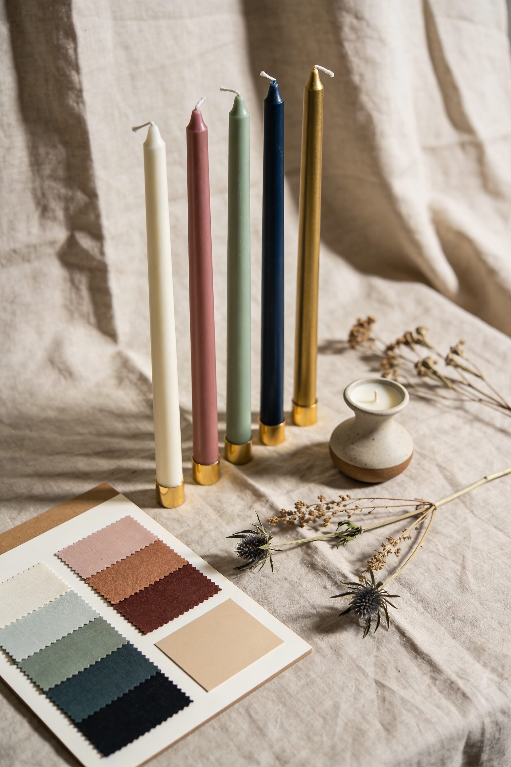
All right, here’s the thing: you’ve got three color strategies that actually work. Spring and summer call for soft pastels—blush, lavender, pale blue—paired with cream or glass holders for that garden-vibe energy. Come fall and winter, go jewel-tone dark: emerald, burgundy, navy with brass or wood. But honestly? Neutrals like cream and beeswax are your secret weapon year-round, adapting to any season without fuss. Trim those wicks to a quarter inch, space them twelve to eighteen inches apart, and you’ll nail the ambiance every single time—but there’s more to matching tapers than just color.
Key Takeaways
- Spring and summer events pair beautifully with blush, lavender, and pale blue tapers in cream or glass holders for romantic, garden-inspired settings.
- Fall and winter occasions benefit from jewel tones like emerald, burgundy, and navy in brass or wood holders for sophisticated drama.
- Neutral tapers in cream, beige, and taupe adapt seamlessly across all seasons and decor styles without requiring seasonal swaps.
- Ribbed tapers add textural interest and catch light differently, while smooth tapers offer versatility and pair well with ornate holders.
- Space tapers every twelve to eighteen inches and layer with varying heights using votives or tea lights for balanced, visually appealing arrangements.
Spring & Summer Tapers: Soft Pastels and Light Hues
When you’re decorating for warmer months, soft-pastel tapers—that graceful, slim candles that burn from a single wick at the top—are basically the seasonal MVP of candlelight. I’m talking blush, lavender, and pale blue. These colors create romantic, dreamy touches that make your space feel like a garden motif come to life.
Now, here’s the thing: pastel pairings work because they’re forgiving. Pair them with cream holders or simple glass vessels, and you’ve got instant spring energy without looking overdone. The soft glow they cast won’t overwhelm delicate table settings or flower arrangements.
You’ll want to trim those wicks to a quarter inch before burning—prevents unnecessary soot and keeps that gentle light consistent. Trust me, one charred wick ruins the whole vibe you’re going for.
Fall & Winter Tapers: Deep Jewel Tones and Rich Colors
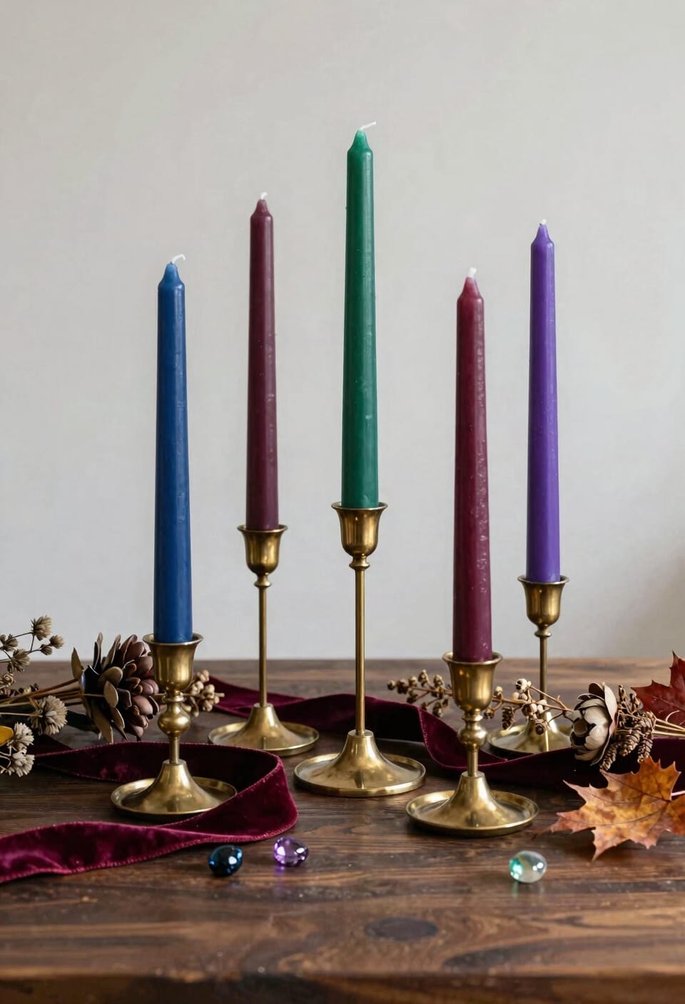
Drama arrives the moment you switch from pastels to jewel tones, and that’s not an accident—it’s basically the whole point. Emerald green, deep burgundy, and navy tapers transform your space into something genuinely sophisticated. You’re not whispering anymore—you’re making a statement.
Here’s the thing: these rich colors work brilliantly with moody accents. Pair them with brass or wood holders to amplify that autumn-into-winter vibe. Ombre gradients in burgundy-to-black create incredible focal points on your tables without demanding much effort.
Look, fall and winter deserve candles that match their intensity. These deep jewel tones cast warmer glows than you’d expect, hitting your centerpieces with soft drama. Light them early, trim your wicks to a quarter-inch, and let the season speak for itself.
Neutrals: Your Year-Round Taper Foundation
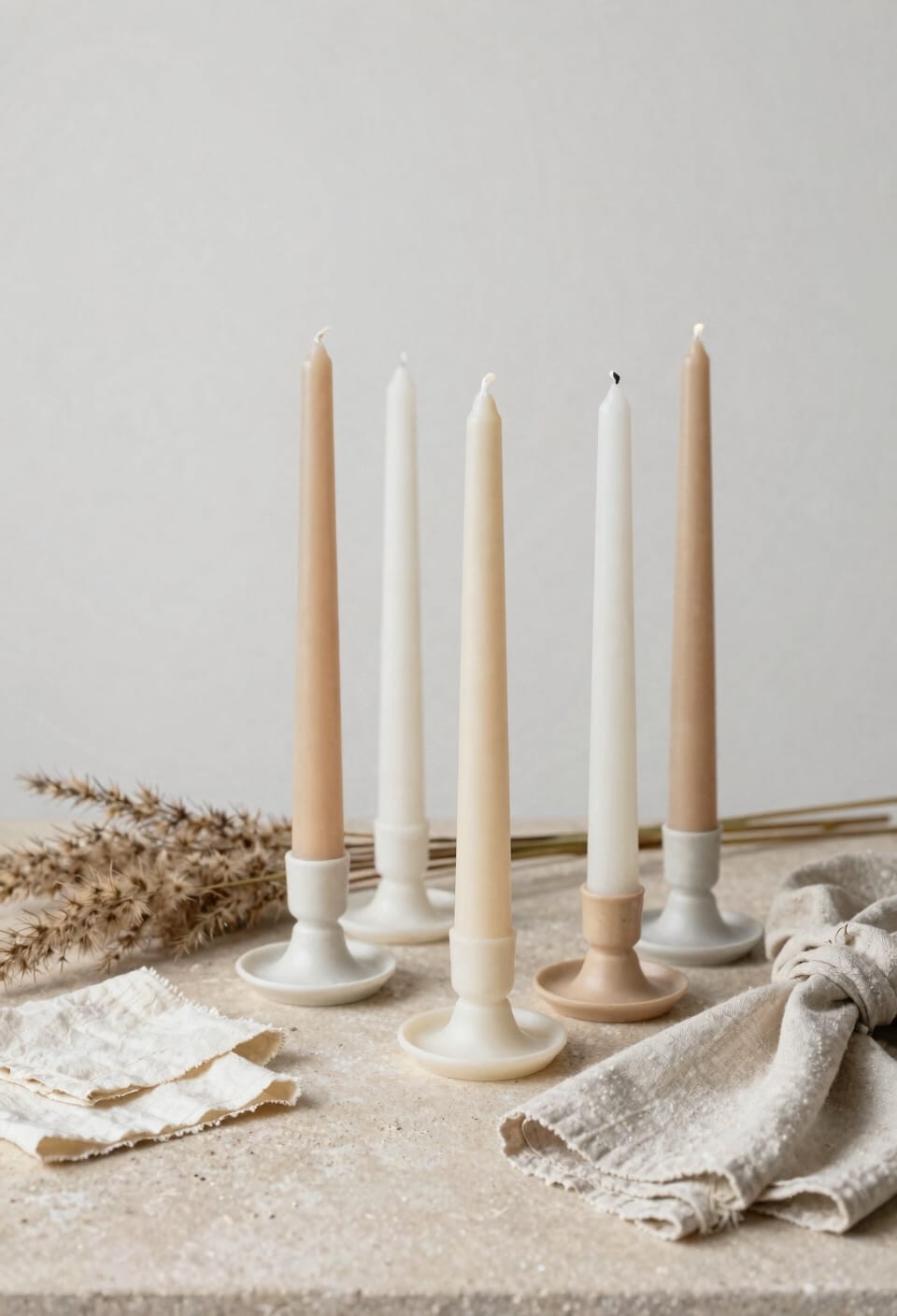
Neutrals are the workhorse candles you didn’t know you needed—the cream, beige, taupe, and gray tapers that slip into literally any room without causing an identity crisis. Here’s the thing: these aren’t boring. They’re strategic. While jewel tones demand seasonal shuffling, neutrals handle year-round pairing trends effortlessly. You’ll pair them with spring florals, autumn metallics, winter whites, summer linens—they adapt like chameleons in sensible cardigans. The real magic? Neutral shifts between seasons become invisible. Swap your deep burgundy tapers for cream ones, and your dining room doesn’t scream “I forgot to redecorate.” Beeswax tapers lean naturally warm and golden, giving you that cozy glow without overthinking it. Stack a few neutral options in your holder collection, and you’ve basically solved decorating forever. You’re welcome.
Strategic Placement and Spacing for Maximum Ambiance
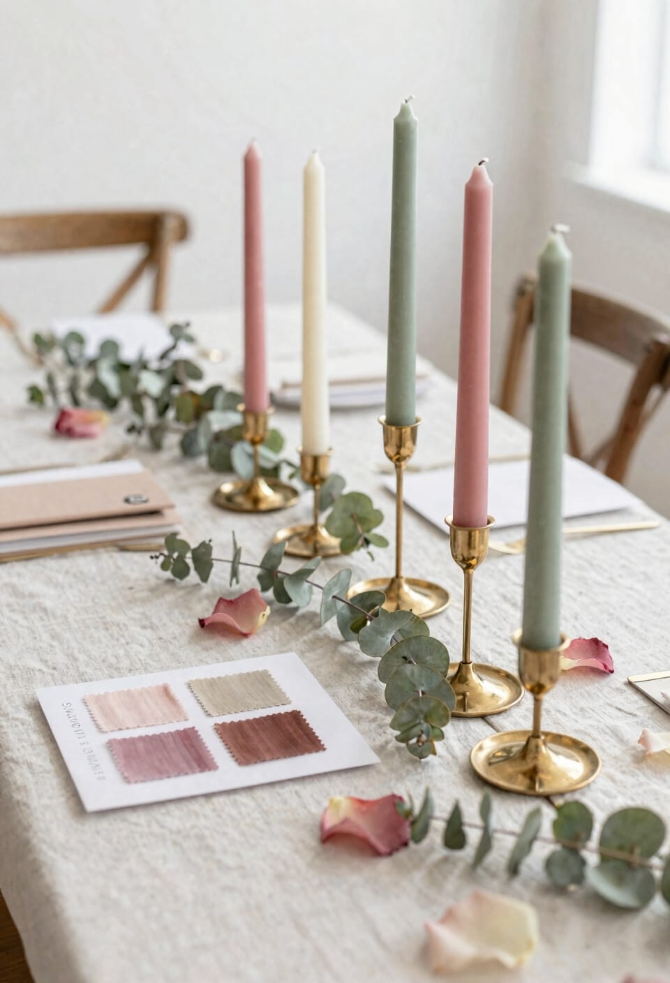
All right, here’s the thing: you can have the most gorgeous tapers in the world, but if you plunk them down like you’re playing candle roulette, you’ll end up with either a dark corner that reads “forgotten” or a table that looks like a fire hazard waiting to happen. Space your tapers with intentionality. I’m talking balanced spacing across tables—typically one taper every twelve to eighteen inches—so you avoid that clustered, chaotic look while still casting enough light. Think centerpiece layering: pair tapers with shorter votives or tea lights at varying heights to create visual depth and make certain even illumination. This strategy transforms a scattered collection into a cohesive design. Your glow becomes purposeful, not accidental. That’s the difference between ambiance and a near-miss disaster.
How to Match Tapers to Your Wedding Color Palette
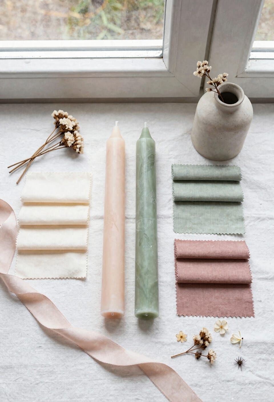
Now that you’ve got your tapers positioned just right, it’s time to actually pick the ones that won’t clash with everything else you’ve planned. Start with your bride bouquet and work backward—color theory matters here. If your flowers lean blush and lavender, those soft spring tapers will sing. For fall weddings, emerald green or deep burgundy creates dramatic lighting contrast against white linens. Check venue restrictions first; some places have strict rules about open flame. Consider seasonal symbolism too—it anchors your whole vibe. Gold metallics? They elevate glamour instantly. Don’t forget guest favors; matching tapers make thoughtful keepsakes. The key’s choosing colors that complement, not compete, with your overall design.
Ribbed vs. Smooth: Choosing the Right Taper Texture
Once you’ve settled on your color palette, you’ve got to think about texture—and I’m not talking about how the wax feels in your hands, though that’s weirdly satisfying. Ribbed tapers (those grooved, ridged ones) elevate your decor instantly. They catch light differently, creating visual contrast that smooth tapers simply can’t match. Here’s the thing: ribbed textures demand less texture maintenance because dust and fingerprints hide better in those grooves. Smooth tapers, meanwhile, show everything but offer versatility—pair them with ornate holders and they’ll look classic or contemporary depending on your vibe. For weddings, I’d lean ribbed if you want drama and sophistication. For everyday home decor, smooth tapers paired with quality brass or wood holders give you maximum flexibility when you inevitably redecorate next season.
Coordinating Tapers With Your Home Decor Style
Beyond the texture choice you’ve made, your tapers need to actually belong in the space you’re putting them in—and I don’t just mean aesthetically, though that matters too. Here’s the thing: successful coordination relies on understanding color contrasts, pattern mixing, and material pairing with what you already own. Think about light reflection off your existing decor. A cream taper glows differently against dark wood than pale walls. Consider scale harmony—don’t drown a small side table with oversized holders. Seasonal swaps keep things fresh without replacing everything; rotate between warm burgundy for winter and soft blush for spring. The goal isn’t perfection. It’s creating moments where candlelight actually enhances your space rather than clashing with it.
Taper Sizes and Burn Times: Practical Selection Guide
When you’re standing in front of a shelf of tapers at different heights, it’s tempting to just grab whatever looks pretty and call it a day—but here’s the thing: size and burn time are actually connected to whether your candles will perform well or peter out halfway through dinner. Taller tapers typically burn longer, sometimes six to eight hours depending on wax quality and wick thickness. I’d recommend standard 10-inch tapers for most events since they’re reliable workhorses. When setting them up, use safety spacers between holders to prevent heat damage, and keep wick trimmings cleaned away so your candles burn evenly. You’ll want that steady, predictable glow, not a sputtering mess.
Budget-Friendly Ways to Maximize Taper Impact
All right, here’s the thing: you don’t need to drop serious cash to make tapers work hard for your event. Bulk sourcing is your secret weapon—buy tapers in larger quantities and you’ll slash the per-candle cost markedly. Pair those affordable tapers with brass or wood holders you already own, and suddenly you’ve got designer-looking centerpieces. Here’s where it gets fun: consider DIY dipping if you’re feeling adventurous. You can customize colors and lengths while keeping costs minimal. Space tapers thoughtfully across tables instead of clustering them—strategic placement creates impact without waste. After the event, repurpose leftover tapers as home decor accents. That’s not budget-friendly; that’s just smart.
Frequently Asked Questions
Can Taper Candles Be Safely Repurposed as Home Decor Accents After Wedding Events?
Yes, I’ll safely repurpose your wedding tapers as home decor accents. You can trim wax remnants, display them in holders, or try scent layering by combining partially burned tapers for custom fragrance blends throughout your home.
What Candle Holder Materials Best Complement Different Taper Colors and Wedding Themes?
I’ve found brass holders elevate jewel tones beautifully—like emerald tapers gaining instant sophistication. Marble bases complement blush and lavender romantically. You’ll discover glass pairs with metallics for glamour, while wood holders ground rustic earth tones perfectly.
How Do Beeswax Tapers Compare to Paraffin Options for Year-Round Decorating Needs?
I’d recommend beeswax tapers for year-round decorating because they’re naturally durable and provide a consistent warm hue. Paraffin drawbacks include shorter lifespan and less aesthetic appeal compared to beeswax benefits.
What Specific Spacing Measurements Prevent Cluttered Table Appearances at Events?
Like breathing room for dancers, I’d space tapers 12-18 inches apart for centerpiece spacing that flows naturally. I’ve found aisle runners benefit from candles placed every 3-4 feet, preventing visual chaos while maintaining elegant sophistication.
Do Vibrant Rainbow Tapers Work Effectively as Focal Points in Traditional Wedding Settings?
Rainbow tapers won’t work well in traditional settings because they lack the refined color symbolism that classic weddings require. Their bold contrasts clash with elegant aesthetics, so I’d recommend muted, coordinated hues instead.
Conclusion
Now that you’ve got the color game down, you’re ready to set the mood in any room. Matching your tapers to your space isn’t rocket science—it’s like seasoning a dish, where the right hue makes everything else taste better. Grab holders that complement your picks, trim those wicks, and watch your ambiance bloom. You’ve totally got this.